Saturday 27 December 2014

Designing a logo

I've been working on the logo for my comic, to make it easier I used Adobe Illustrator to make the logos. Its been months since I've used illustrator but shouldn't be difficult to remember and not so different mostly from photoshop. drawn some shapes to get it right to match the sketch on the right.
The reason why I went for this design was so it would be considered unique and also be part of the series like many companies and organisations have beside their own titles. 


1. By making a circular shape, I've made three circles for the first step, stretched them a little and moved them into places to late cut out and make more curved shapes. I would do the same thing which had taken nearly 15 minutes to get it done and ready to join the shapes together.


2. Taken a few minutes, creating multiple circles until I got this. It was a little tricky to get the curves just right but happy how it turns out and did so for the second below.


3. This was was slightly tricky to work on, while I was still rusty on adjusting the lines as the rubber for Illustrator is MUCH difficult to use then photoshop. Went towards the U/V shape, since I've still got a lot to learn how to use illustrator I had to save it and copy on to Manga studios seeing as they don't except different formats.


4. Here are the two now completed and just need to make the final piece for the logo. The one below was down using manga studios to create a point. I was intended to finish it off to make the gaps between but scrapped the idea and saw no need to do any more to it.


5. for the final step of the design, I now had to make this one more curved, getting it right was the hard part and made sure not to make them look too thin around the edge.

did a little more on the experimentation and added another circle on top, found it to be much better so far and just need to cut the part below.


6. Repeating the same progress on a smaller shape and got this. Now all I had to do was copy and paste, then reflect it on four different angles and made sure they have space between each other.


7. This is how it turns out and now ready for some colour for the next step of making the cover. I made sure the two were at a proper size and not too big to the other and plenty of space in between the two segments.

Sunday 14 December 2014

Research on Mars

As the story would take place on Mars I took some thought and time to do some research on the Red Planet for my Travelling Man project. As it's one of the most common use of sic fi genres for writers and artists alike throughout the century. John Carter of Mars, Mars Attacks, the Martian Manhunter and the War of the Worlds are some of the famous examples of the science fiction.

Mars in fiction:
It had captivated our imaginations and purpose to go there to make it our second home with the growing population on earth overcrowding and colonisation seems to be the solution for our future due to the distance between Earth and Mars and the only planet with no hostile atmosphere, but we still need to find a way to make it breathable one day to inhabit this world in the future.

In common fiction media for Mars it is usually a colony, terraformed planet or home planet of martian civilisation for many roles like invaders in movies.

Facts about Mars:

One of the main facts of how it got its name was, like many of the planets in our solar system was named after a mythological god/goddess. Mars was the Roman God of War and the son of Jupiter.

For centuries Mars has been one of the most favoured planets in our solar system, the main attention for exploration and our theory wether life had existed on the Red Planet in the past or not due to the thin atmosphere and iron oxide in the air that would make life on Earth unable to survive, there is possibility that microbes could thrive on the planet or beneath it as we still don't know much of Mars and its secrets. The two polar regions covered in ice show some promising suggestions as micro organisms can survive any environment that humans can't as scientists have studied places too hot and cold on Earth for examples. Due to the further distance from the sun and a small world, it completely lacks any oceans, only a single barren wasteland of dust and sand.

Also for the fact that since Mars doesn't have a moon but two chunks of rock in orbit, it mostly tilts about by the gravitational pull from the Sun or other large planets like Jupiter. And the seasons would be different and

The most well known features on the planet is the great large system of canyons known as the Valles Marineris, but the region is called Tharis on both old and new maps of Mars it is over 4000 km long, which in meters is 2500 miles. One of the largest canyon rifts in the entire system.

Probes have been sent to Mars to map out the entire planet and collect mineral samples from rocks for further studies.

Terraforming research:
There have been many research on how terraforming planets will work but mostly different depends on the mass and size of the planets.

Major changes for Martian environment to change for human settlements, examples like:

  • Making the atmosphere more thicker and breathable using the right chemical constituents. Insert greenhouse gas to make the planet warm and cause the ice caps to melt to produce water and introdue CO2 to the polar caps.
  • Outposts and colonies that proceed with the process to monitor the changes in Mars' environment and atmosphere while settling 
  • Introduce algae and microbes on some parts of the planet to absorb sunlight, the ground would then warm up the atmosphere more and give Mars a new small oxygen contribution from the algae. Makes a good step to the direction for terraforming process.
  • Obviously asteroids with ice would be good use to make water, humans will have some difficulty directing them towards Mars and bombard the surface. This happened on Earth billions of years ago when there was barely any signs of life after it was formed.
  • Satellites to direct sunlight to direct solar radiation.
  • A large moon about the size of ours would be enough to keep the planet from tilting about by the gravitational pull. Keeping a tidal effect and important for any marine creatures we introduce to Mars one day.

Friday 12 December 2014

Non-Narrative Illustration

In the first few weeks since the second year started, I have been researching and developing my ideas for my concept designs by looking at the other illustrations and research about them. Looking into art magazines and books to build up ideas in my head.

ImagineFX
Useful sources like ImagineFX gives open information about artists and their work, introduce many styles if art, how they are done and how to find stuff like books, brushes, paints, pens, photoshop, art programmes for artists and others who appreciate fantasy and science fiction art.


Each issue of the magazine provides a tutorial from artists to explain how they used their skills to create artworks. Introduce illustrations from games, books, movies and tv series. They advertise a lot of the art, useful for artists to find that could help give ideas, what inspired people to become artists and what can help others to develop their skills further.

Flipbook 
wanting to make something to try out while working on my project, then I thought why not make something new and try it like the flip book. Knowing it be a little tricky to draw the same character on a different page so I picked an owl and draw it flying. 


To get it right I watched a few videos of owls flying in slow motion to get the movement right and draw one after the other in a second or so for the flip book. Making it easier to memorise the formation and what the owl would do next instead of using my head to imagine it.


Using 16 steps into pages for the book after finishing the animation in my sketchbook, coloured it in and giving it a sort of texture for the background. Figured it be better then having it just a drawing and no colour. The hard part was after printing them out was making sure the pages were of the same size due to the measurement mistakes so I had to be careful when cutting them into the same shape and size.


After getting it down I punctured the holes, used a string to tie the pages together into a flip book (mirrored) and actually liked how it turned out in the end with all the hard work put into this. The hard part was making sure the flip animation was good enough since this has been the first time I made one and quite enjoyed it.


Sunday 30 November 2014

Mike Mignola

Mike is a comic book artist and writer who best known for creating the Hellboy series for Dark Horse comics. Also took part in the animation projects such as Atlantis: The Lost Empire that I later recognised as it was also used for the animation adaption of Hellboy. He described his art style as "German Expressionism meets Jack Kirby by some artists he may have talked to about. I find his work in gothic horror really interesting in the way they are drawn and made expanded his imagination of the Hellboy universe of creatures, monsters and demons from folklore and legends.

http://www.artofmikemignola.com

Tuesday 25 November 2014

RJ Palmer

RJ Palmer, is a freelance concept artist and illustrator who specialises in character and creature designs, and really incredible work and effort he put into his drawings. I really liked how amazing his artwork is and even make realistic pokemon that are my favourite of his illustration when I follow his work on Deviantart, morphing them into actual creatures that interact in the real world and write stories about them. I have been a fan of the series when I was a kid and still remember some of them when I watched the series, and also really been keen of seeing realistic pokemon by artists but hard to find until I found Palmer's as he goes by the name Arvalis.

He studied living and extinct animals to get the Pokemon to look with real world influence and separate them from the anime version which is a useful resource of making up a strange animal by looking at the skeleton, physical form and texture, but it does show he's been looking at prehistoric animals and dinosaurs. The colour work is really unique, really talented on the scales, skin and fur for the creatures, the characters are well thought out They are really unique and very original which I can't help but admire them and made me want to do more thought of ideas and looking at his work I can't help but look at their appearances and look at more unique animals in the natural world


http://rj-palmer.com
http://arvalis.deviantart.com
http://techgnotic.deviantart.com/journal/Jurassic-Pokemon-495463998

Tuesday 18 November 2014

book series idea: New Genesis

As I have been doing many drawings of aliens, monsters and characters for ideas. I have been doing some rough ideas of how the series should take place and wanting to be a well and thought I let my fellow readers and friends know what it should be about. Holds many genres, cyberpunk, alternate history/universe and science fantasy.

New Genesis: Dance of Blades

About:
Starts out when in the mid-20th century humans discovered they were not the only sentient species living on Earth, three different races: Kronan Ree, Lemurian and Djinn approached them as the nations were still at each other's throats. Allowing their paranoia to overwhelm them, war lashed out on the three races despite the three grouped together to form peaceful relations with the majority of humans.

After nearly nearly several years the war came to an end by a neutral organisation known as the Society, dedicated to maintain the balance of power on Earth and an event which was known as New Genesis that changed nearly all life on the planet, causing mutations on some species and individuals by alien technology.

The four races now live in co-existence after many decades. But a threat lurking within the shadows from space and on Earth, leading the world into a new war unlike any other in history.

Characers:
coming soon...


Monday 17 November 2014

DC Comics

DC comics has numerous stories about superheroes protecting the innocent from super villains and doing what is right. Forming crime fighting groups like the Justice League, Green Lantern Corps, Teen Titans and Young Justice. It is one of the most popular comic book series and has been published for nearly a century since the first issues of Superman, Batman and Wonder Woman show ere the original and common members of the Justice League.

Many characters in the DC universe have super human abilities, wear fancy outfits and disguises to conceal their identities but the villains are well known in public when arrested. But not all characters are entirely human as the majority of them are mostly alien, supernatural entities, gods, mutants or meta-humans. Although not all of them have background histories to know how they received superpowers in the first place.

That wouldn't have been a problem in the past but over the years, fans want solid info on how the characters came to be as they are like Superman who was a baby being sent to Earth after Krypton blew up and recieved his powers under the exposure of a yellow sun.

Batman became a crime fighting vigilant after witnessing the death of his parents while under the impersonation of a multi millionaire Bruce Wayne.

The Green Lanterns use their rings made from an energy source made by an ancient race of small blue skinned humanoids known as the Guardians of the Universe and allow the users' will to manifest whatever they think off so long as they wear them. It is also same for the other power rings but are different by emotions and formed their own groups like the Sinestro Corps, Red Lanterns, Orange lanterns, the Black Lanterns, Indigo Tribe and Blue Lanterns.

There are many characters who use magic from their and others from chemicals either from experiments or accidents which in real life would've been fatal but they're more popular in fiction in other comics also.

But what I can't stand is how too powerful some characters are like Superman who was the most powerful hero in his time, doing things impossible with super strength, incredible speed and flight to defend the world. But over the years the comic writers did seem to give him weaknesses like Kryptonite and knowing that there are other characters as strong as he is. It should be important for characters like DC not to have overpowered heroes and villains as they would have to learn to adapt their abilities.

Wednesday 12 November 2014

New project Comic illustration

On to our next brief, we have been given multiple choices of what to do, it was a little hard for me to choose which one but felt like I wanted to do the Travelling Man brief where it has more freedom of ideas and imagination, the other comic brief was more towards social live which to be frank, didn't suite me at all so I thought I give this another go to make a comic but better then the first one I did. Those of you who don't know I did one two
30. years ago on a final major project in Graphics CCAD, looking back from my latest work it was not as good as I imagined but got the story good. It was meant to be a teaser for the series I'm dedicated to make become a series.

so for my idea, it possibly be some scifi fantasy, like an introduction to a series

Below: This was what I made and thought of using the same title but change it a little, something to recycle for future ideas. what I plan to do is by drawing the sketches of the pages and write down the transcript to plan out the page on the other using my sketchbook. Make advert pages related to the comic issue.

http://soulslayer317.deviantart.com/art/New-Genesis-comic-cover-376230862.

Wednesday 5 November 2014

My evaluation on the album illustration

When we first received our first module to illustrate albums of our pick and create merchandises. I was having some hard time choosing which musician to work and research on but found a liking to Agnus Obel's classical and relaxing music, so I went for her and looked into her background, how she was inspired by other musicians and sought out how to make good merchandises. I drew a few sketches, researched on album illustrations and what I thought from my perspective.

The first one was working on the landscape poster, I thought that since her music was relaxing and soothing with her scandinavian heritage, why not make a natural landscape but a little more towards folklore/fantasy, it was easy working out how it would look but took a while to finish it off then the rest because of working on the texture, getting the trees right. What I liked about it is how it looked like a dreamscape with the night sky being purplish and the river containing the northern lights and stars rather than the sky. I really liked how it turned out and added the owls which were a nice touch to give it a more wildlife activity and unspoiled. Originally I was going to add a cabin in it but I thought it didn't work so I removed it. The annoying part was working on the title, wanted it to be original and wanting to have the italic style but so far that didn't work either and used other text and make sure it would fit in with the poster.

After completing the first one I now moved on to the rest and had this idea of making a flip book for the editorial, I know it won't be perfect but nothing wrong of trying it, so I decided what to animate and picked an owl since owls are in Europe and watched a few slow motions of owls flying. I used my sketchbook to practice and used each page on the bottom corner and made sure they were in the right place to make it work. After completing it in my spare time, I took each shot of them on the computer and used a page for eight shots, worked on the background and originally intended to leave the owl untouched but thought it would be nice to have some colour and did so. Had to trim them to be the same shape and tide them together. After completing it I felt it was really good for my first try and how it turned out. The hard part was getting them in the right place so it wouldn't be too messy and any mistakes on it.

Making a few prints wasn't easy, it was very difficult to know what sort of print I wanted and people gave me suggestions yet I still don't know how since it wasn't my strongest but wanting to give a go for a good grade. It was not easy finding iridescent paper, or holographic sheets as some prefer but finally found some and ordered them straight away on special order. I used some of my earlier sketches and used sheets to experiment before proceeding to use the sheets I've ordered and used different paints and had to have a little bit of help to make sure they were right at first until I understander how to print them properly. It was not easy spray painting outside when it was windy but I was helped out knowing where to find a room to do it inside without causing problems. What I liked about it was how I learnt new experiences and being careful of using paints and new techniques to try but not easy to remember but there's always experiences I can use in the near future.

ON my final merchandise was making the cd cover, all I had to do was make it different but used one of the owls from my poster so that it had connections. Giving it a winter background, a blueish moon and an owl flying in the night. I figured the background looked too plain so I added some snow for the final touch and to be honest it was just a random idea but really liked how it turned out, find it funny how ideas just come and not knowing they would be good.

What I liked about the module was getting new ideas, experimenting with tools in digital, printing and paints to build the ideas. I actually enjoyed doing the flip book and glad everyone liked the idea, the poster is my favoured work since it had a lot of landscape and wanting it to be a digital painting and offered suggestions that I took and used.

The things I didn't enjoy were trying to find the sheets needed for editorial and went to many shops looking for them. sent emails to shops but never on time before the deadline. And always worrying that I keep forgetting something that was important which usually happens when focusing on my work but it turned out good in the end and hopefully doesn't happen too often in the future. I did enjoy this module and glad its completed.

Tuesday 4 November 2014

Agnes Obel Poster

1. So I wanted to have a natural landscape, something to fight in with Agnus' music and make it look natural and relaxing to look at. Drawn a few sketches and found this much more worth to work on for one of my projects for the module. All it needed were trees, unspoiled landscape and mountains. I wasn't so sure about eh cabin really, so I decided to remove that to make it truly untouched by human beings.

2.Making a river with bright colours and reflecting the northern lights wasn't entirely easy so I took some moment to think how they would look and find a few pics of other Northern Lights seen at night. Knowing full well they don't go in a full stream as some tend to fade out then the rest and flow like wind or water. Gone for the purplish colour for the night sky and wanting the lights to flow like an actual river, gave one side a more brighter pink to blend with the darker colours as it reflects the sunset from the sky.


3.I focused on the green light and added more brighter green to some areas where they be more concentrated then the rest, used the smudge tool to pull the mist about to make it thinner. The black line had to go as I didn't want them to be seen in the river, otherwise it could ruin the moment replace them with ripple lining to replace them, making sure they interact with the sides and go along with the river. 

4. Giving it a more light pinkish sunset on one side to cast the reflection of the sky instead of a normal black sky. Adding stars to go with lights, some small light dots and the larger ones with twinkling sparkle to make it more of a night sky, I wanted the river to have a natural ripple, not a solid line to show how they interact with rocks, shores and land.

5. Going for the dawn/sunset theme I used the purple and pink colors to be in place of the orange and dark, blend them together to make a natural change of color in the direction of the sun would be. The mountains I was working on had to have a dark grey color and dark areas for the shadow 

6. Adding more shading and texture to the snow but what I was starting to dislike were the trees, they don't have the natural formation like real life trees have. The green leafs were not so good and decided to restart on the forest, looked into a few photos on winter trees and sketched a few sketches of trees in my sketchbook. 

7. needing texture which is more important for the landscape, like the snow, wood and sand, especially the rocks, tried out different tools to make a few patterns. The mountains needed a little more work before I do more on the trees. The orange line demonstrates how they will appear before drawing them.

8. Following the designs of my sketches of the trees, I made the closest trees bigger then the rest for the distance rather then being the same size. Giving them an earthly brown color and lighter brown/red for the texture.

9. I now moved on to adding some owls to make the landscape more of an unspoiled natural landscape with wildlife, so I scanned in the sketches of two owls and used them to find a few places before I draw them. Wanting them to look lively and interact with the landscape.

10. Went back to finishing off the river and give it a better look with a group of stars, some that are bigger then the rest would have a twinkling look and stretched them on four sides,  giving a more starlight impression.

11. I went back to the page where the owls are and decided to look at some natural colours owls normally have, each one be different to the other. one yellow/brown and the second grey and black.

12. Now that I got the two owls complete, I moved them into a few places to find where they are more comfortable at, making sure they don't fill one side or leave too much space in the landscape. SO I moved the one on the right by the river so it would appear to be soaring over the river and the one on the left clinging on to a branch. 

13. Intended to make an original design for the title, make it bold but italic to fit in with the poster, however it didn't seem to work, so I experimented with the text until I found a better one such as the pic below and thus completes my poster.


Tuesday 21 October 2014

Album merchandise

I thought of what my merchandises would be for the album cover project, thought of making a flip book and a flashy poster. Taking some research how to make a flip book myself but not wanting to use sticky notes as they can easily come off and little space to draw them. So, what I intend to do for the alternative is draw this out on my sketchbook by one page after the other, scan them in and print out to make a flip book.

Down below you can see the plans how my owl will fly and makes its landing. More towards a cartoon style but in a good animation. As for the flashy paper I need to find something called a iridescent paper to do that but not entirely easy finding.

Album cover illustrations

Gathered some examples of illustrated album covers and explain some I listened and research into to get a better idea for my own project.


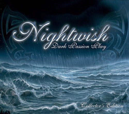
Nightwish: Nightwish have wrote their songs close to mythological and fantasy themes . Some were a tribute to J.R.R. Tolkien and Walt Disney. They have a female league singer to add emotions to the lyrics. Whenever I listen to their songs I picture things in my head for ideas I come up with and stories.

Not all their songs are based on fantasy, they also tell about history like the American Civil war from a soldier's perspective, for 10th Man Down and the situation of Native Americans in the 19th century for Creak Mary's Blood. Despite having a dark meaning in their albums, they also produce less serious songs including the bonus track.


Skillet: Skillet is one of my favourite bands for their mix styles of rock, christian rock music and symphonic metal but more towards alternative rock. Two of their songs have been illustrated: Rise, as it says on the cover where in the music tells about a girl rounding up a few kids to rise up against a faceless horde which restrains them of their freedom. Another in a song called Not Gonna Die with the same character facing off a hydra with the help of a lion.


AFI Buries: I found this illustration from the band for research and the cover is really bizarre and more like a dream-like state, but with more horror from what I can describe from the two beside the elephant were tusks coming out of one man's mouth and both having huge buck teeth like rodents, wearing robes, a skull for a head gear and leaf crown,

Disturbed: One of the favourite rock bands, Disturbed was originally called Brawl until they changed it's name in 1996. The band write their lyrics based on real life experiences, making their lyrics more cryptic to send messages to their fans. Another Way to Die for example explains the situations all around the world with wars, climate change and terrorism accruing daily. Land of Confusion talks about governments merely arguing each other not taking the big picture of what's happening to their countries and some nazi-like group tries to take over and revolution starts. Usually shows greedy and selfish politicians which we seem to have in real life.

Tuesday 30 September 2014

Album cover illustration

I started finding some research on artists and music of the albums so that I would illustrate one of the selected albums after some research and album covers, what represents their style of music and how to build up ideas of my own to concept illustrated album covers. The artist I chosen for this task is Agnus Obel, a musician who is into classical and relaxing music and I thought could work for the project and make sure it relates to the musician.

I would probably start my research on her first and listen to her music and write down the lyrics. Her style of music is more towards classical when using the piano, violin and other sorts of anxiliary instruments used for the lyrics. So far my target audience would be more towards people who find it more relaxing or prefer the classic theme then other types of music like rock and rap for example. Agnus has a soothing, intense and also angelic voice clearly shows talent and not always trying to rise the voice level high like most singers would. I actually find them relaxing myself and see she is really good.

So far from my research, Agnes is influenced by a few artists such as Roy Orbison, Joni Mitchell, french composers Claude Debussy, Erik Satie and Maurice Ravel.

The lyrics I chose to listen would help give me ideas to illustrate the poster.

Aventine
Will you go ahead to the Aventine
In the holly red in the night
Dint under my show from the old at heart
Right under you, grinning in the dark

You carried my heart in the night
To bury the wave in the tide
You carried me onto the fields

There is a grave, there is a plot
Deep in the snow, breaking your heart
One step ahead, a thousand miles
A trail ablaze to the Aventine

You carried my heart in the night
To marry the wave with the tide
You carried me onto the fields

You carried my heart in the night
To bury the wave in the tide
You carried me onto the fields

Play it down, down, down...

What I thought of illustrating an album is make it more a view of the natural landscape, taken a look at some photos of the landscapes in Scandinavia. Wanting to have a river, few trees and mountains in the artwork, seeing as how Agnus' music is rather more soothing and relaxing, so that's what I am aiming for my project.

I strongly belief it should relate to some folklore and myths, so I was given suggestions of leaving the idea of an earthly based-colour for the landscape and do some experimentation with water colour, pencil and digital before I move on to the next step. It will be a digital portrait but I thought it be a good idea to see how some of my experiments turn out first.

Thursday 18 September 2014

Illustrations of New Genesis

So ok I have done some drawings for my project series I'm writing, slowly but not wanting to rush anything to make it a good one. So I did some rough sketches of creatures, characters and aliens for the series. Down below you would see some sketches I've made awhile ago.

 Left: So here on both pages are two alien races I came up for the later series, on the left is the tentacled alien being I named the Ta'al Vex, not wanting my aliens being naked like many classic sci fi series would unless they don't need to by their biology. I took thought of the Ta'al having a few tentacles and a humanoid torso with a triangular head, also given it two pairs of eyes.

On the right is the H'hindau (Pronounced: Ha-Hin-dau) are a large serpantine species, their faces would have a armoured face with six holes and hair growing from the heads and neck. I pictured it having six limbs also which I'm still working on for another drawing to make sure it looks right and able to move as its important to know how their bodies would move.


Above: Slit-mouth Kuchisake is one of the of my ideas for the series where she is some sort of alien assassin who can appear as a harmless and attractive woman and then turns into a deformed freak, she's clearly based on the slit mouth folklore and I thought that could work for this and give her a row of sharp teeth, lips crack further to the back the jar joints. Wanting to make her skin look stretch and almost turning into something else during her transformation.

Another race for the series would be one of the inhabitants of Earth, they are called the Djinn, clearly  a race evolved from dinosaurs who were originally moved to another planet before the comet hit the Earth 65 million years ago and one of the species evolved into what they would look in the sketch. They are more based on the common Reptilian myths living beneath the earth but in the New Genesis verse they are more advance with technology almost described as magic and have no interest in conquering humans. I pictured them having some form of culture similar to the Arabian fashion but with armour and have feathers in some parts of their bodies similar to human hair. 


I was doing some sketches and doodles, working out how one of the aliens I pictured to look advance and ancient but thought, maybe they would have organic looking bodies. I drew the side view of the creature, gave it some tentacles running down from the head and a crown-shaped crest protruding from the back of the head. Didn't want to give it a mouth but sort of a vertical mouth but they wouldn't be needed to speak since they would be telepathic most of the time. The two circles on the side were where it's arms would be located. I think it would need more work but the head looks good so far, just a bit more of a touch to work on the body.


Here is one of the type of species I am working called the Kronan Ree and wanted them to have the human/animal hybrid appearance and divided by groups from which tribes they are from; canines, arthropods, fish, bird, monkey and reptiles. They are more genetically diverse then humans and able to change between human and animal-like creatures. Not wanting them all to have a human appearance but more of a creature and have. The one above is one of these I was working on and thought how a human-insect hybrid would look like. Would still have the human 'mouth' but with some extra mandibles. 

Friday 22 August 2014

New Genesis illustration: Votao Shen

So its been awhile since I last uploaded anything on my blog and been having a relaxing summer but been on the net just to look at some art work to get some ideas. Been building up ideas of my own for my New Genesis universe and thought, if I was to make a series full of aliens I need planets and maps where they are. So I decided to use what I learned from CCAD and put it to some use to make planet realistic as they can be then what I previously created in my Deviantart account.


The planet I created is called Votao Shen, fourth planet in the Finbiri system, Perseus Arm. Gave it an earth like atmopshere and slightly heavier gravity. Wanting to make the continents have rough edges even from an orbital view like Earth's continents.


Been drawing a few maps of the planets to get the idea, all I did was look at a few maps, either real or fictional to know what continents should have when making my own. I scanned the map and made a new line over the original, that way when I add the texture it would make things easier on the next step. Made some arrangements on the countries until I find the right places for them. Made a few small islands as it they can't all be large.


What I did next was to find a few textures, small, big or large but needed to cut some out and put each piece of texture until I'm satisfied. Once this was done I turned the colour using greyscale and then clone stamped the edges to blend the texture in together using whatever texture I thought would be useful but not too much otherwise there would be repeated patterns. Used some texturse for the ice caps but needed them to be snow.


Finally, I have my own planet with an ocean, green forests and deserts. Although not all perfect but wasn't expecting it to be. Had to do some final adjustment by making some of the countries a little bigger and make some shallow seas by the edges. Wanting to leave some textures about to give some mountainous feature but maybe do more here. So I hope you all like it and more to come!